
You walk into a room and the chairs are all over the place (not under the table) scrap paper and discarded pens lying around. The previous lecturer has left complicated formulae on the whiteboard, students have left snacks and rubbish on the floor. Not a pretty sight. How does your online space compare? This is one place you do have control over and can create a great first impression for your students.
About your online subject site
When you access a UTSOnline site in which you are an instructor you may see a site that has already been used in previous iterations of the subject OR you may have a brand new site that has a default structure. You do not necessarily need to retain the existing look and feel (depending on your Faculty guidelines) – you can customise the style and layout. Below are a few ideas that you can quickly and easily do to make a more logically arranged, stylish and welcoming site for your students.
Configuring the subject site menu
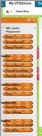
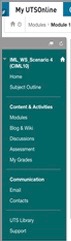
The subject menu is the panel on the left side of the interface that contains links to all top-level subject areas. Some Faculties have a recommended menu structure, but you may wish to add one or two items that are specific to your subject and help students find information quickly. These menu items include web links, content area buttons, tool links, course links, module pages, and blank pages. Dividers and sub-headers can help you organise menu items into logical groups. You can also change the colour and format of the items (buttons or links)
Renaming and reordering menu items
Existing menu items can also be renamed to best reflect your subject content.These items can also be reordered by hovering your mouse cursor on the left side of the item until an arrow appears. If you click-hold and drag on this arrow you can move the item to a new position in the menu. This help page will provide more information on how to do this. If you are wondering whether anything actually needs changing, why not ask your students? Do a spot quiz in class and see if they know where to find things.
Adding a banner
Adding a banner to the Home Page will help students orient themselves within UTSOnline so they will know which subject they have entered. Its an opportunity to add your own creative flair. There is a post on this blog that shows you how to find freely available images. Some nice examples are shown below.


Change the subject entry page
The default entry page in most sites is a dashboard which can appear uninviting. You can easily point to a different ‘landing page’, one of the existing menu items such as subject documents or a custom made set of ’tiles’ that themselves act like a table of contents/menu structure.

For help with any or all of the above ideas, check the video below or speak to your faculty learning technologist. Book a consultation here.